
Flaco’s Tacos

Overview
Flaco’s Tacos is a fictional Mexican Taqueria that prides itself for its traditional Mexican cuisine in a modern, energetic club-like setting. “Flaco” translates to skinny in English and is a common nickname given at childhood in many Hispanic cultures. My ideas was that the companies founder took his childhood nickname and used it as a household name for his business. The goal of this project was to envision a place that is deeply connected to traditional roots while also creating it with a playful and modern theme in mind.
Challenges
Tradition is something that I wanted to embody with this project, but putting a modern twist on that was challenging because of the risks of separating the brand too far from its roots. I was afraid of losing that sense of authenticity.
Research
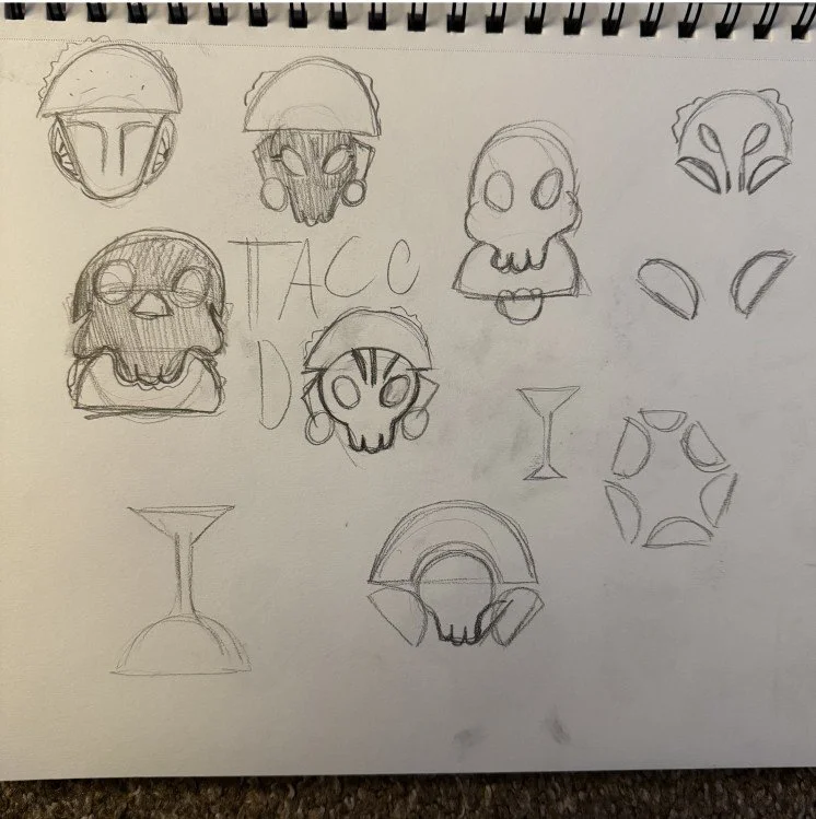
I researched many different aspects of Mexican culture to find some inspiration for this project. My early designs drew context from ancient Aztec civilizations I was very captivated by the mask designs they made.
Eventually I ruled out the Aztec roots because I was unsure with how many people still resonated with those traditions. Plus, I was looking for something more rooted with warmness and community. My new source of inspiration and the one that ended up sticking, the tradition of the “De dia os Muertos” or “The Day of The Dead”

The Design

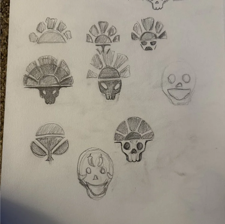
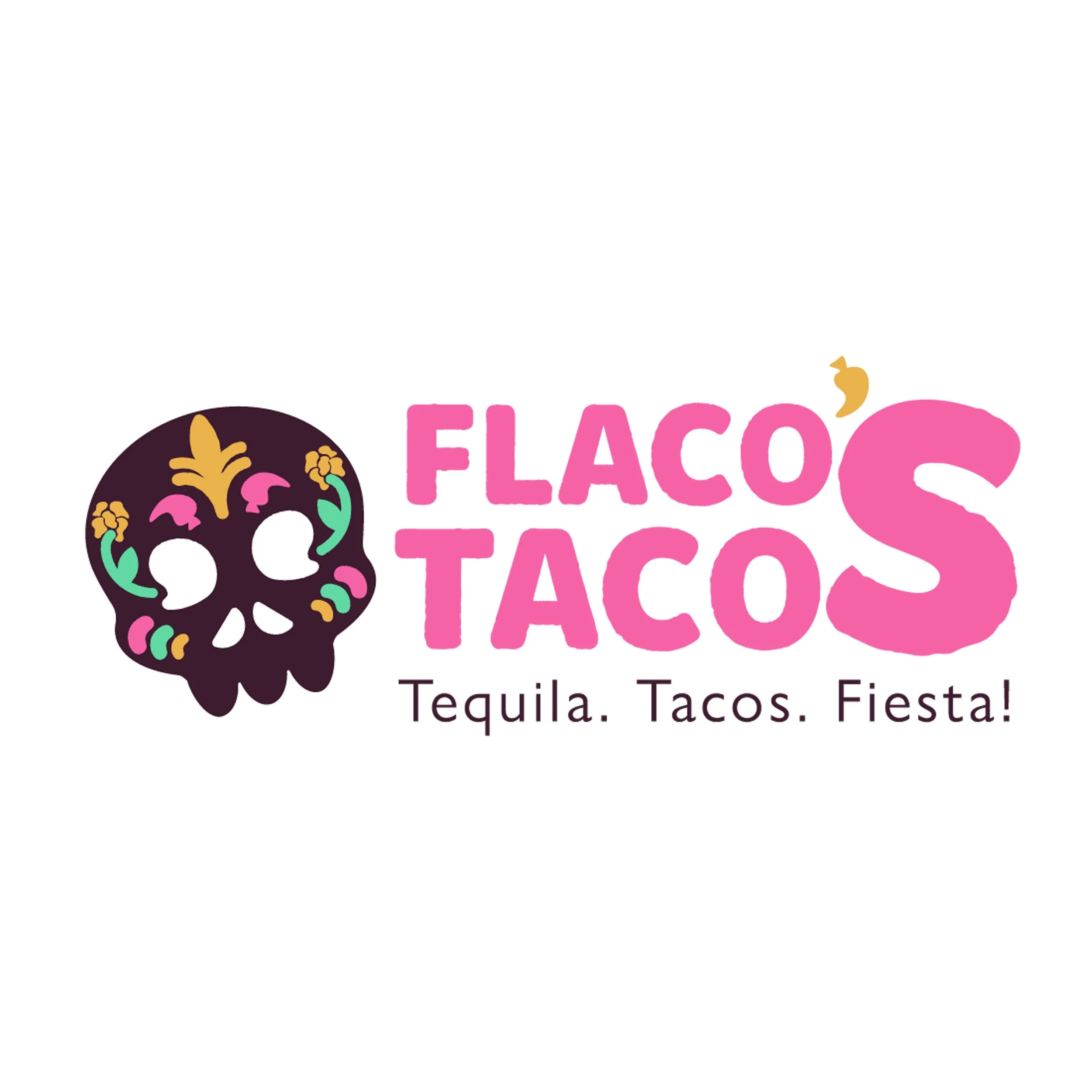
The brand mark of Flaco’s Tacos is a day of the dead Calavera. During the day of the dead, these skulls are painted with beautiful markings as a way to celebrate life and the importance in enjoying it while you have the time. The Calavera of Flaco’s tacos has markings to celebrate traditional Mexican ingredients
Colors
The colors were chosen to be vibrant and eye catching while still remaining in close connection to the day of the dead. I chose for the skull the be dark in order to fit that club aesthetic but also to intentionally allow the more vibrant colors to shine through

01 Brandmark

02 Primary

03 Secondary
The Menu
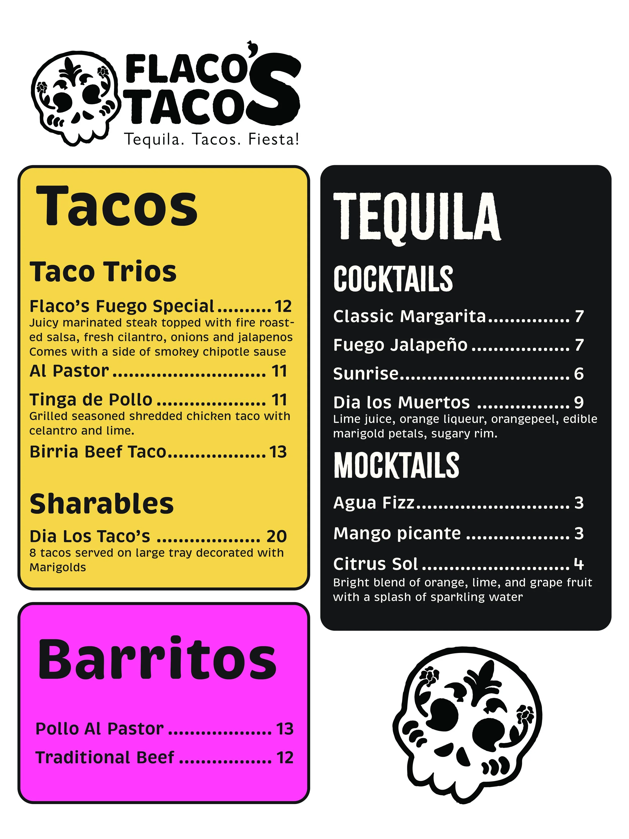
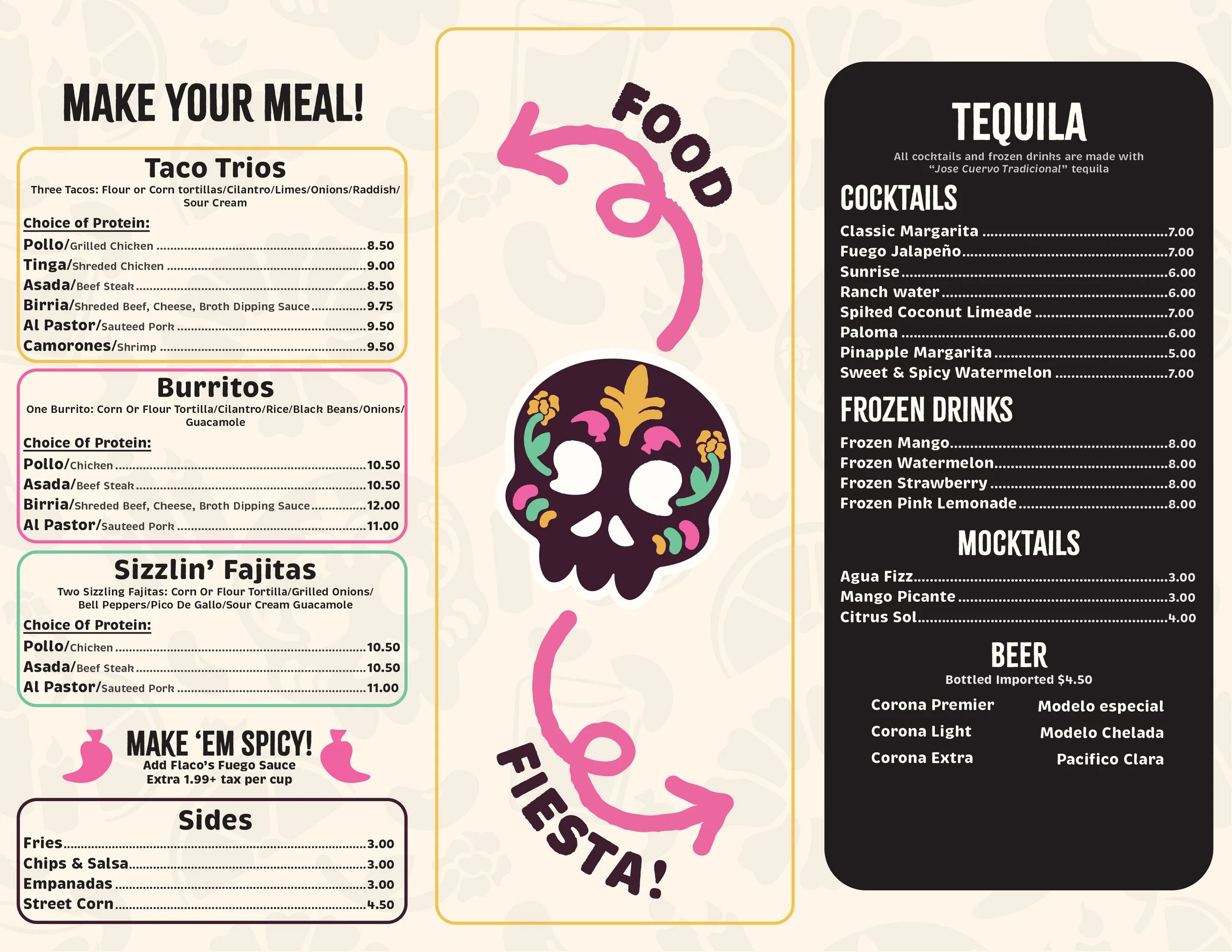
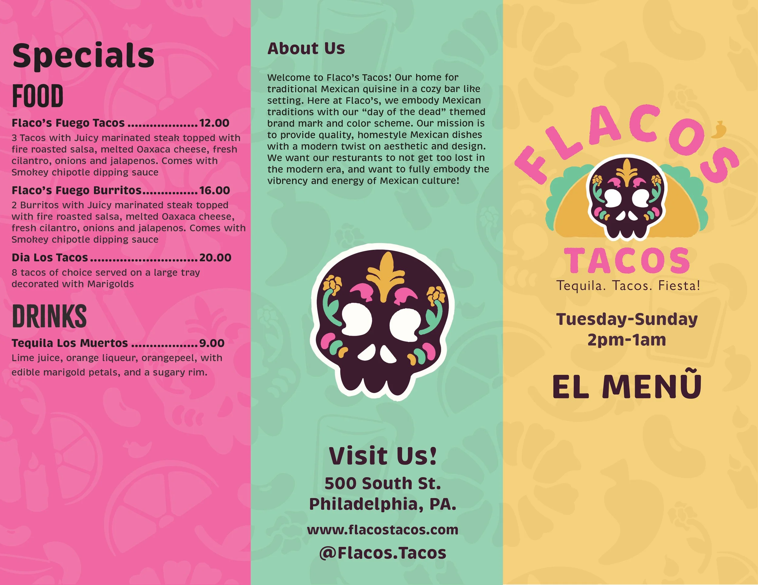
No restaurant is complete without a menu showing all the possible food and drinks available. I knew with this menu I wanted it to be a split of food and drinks considering that it’s a bar/club setting. The first draft of the menu was confined to one page which severely limited the menu items and layouts possible. It also wasn’t the most accessible from a visual stand point.

Revisions
To beef up the content of my menu I decided to opt for a trifold layout. This allowed me to not just add more menu items but also gave me a greater opportunity to add more visual elements to the design. My favorite element of this design is the split of food vs fiesta embodying that fun aspect I was going for.
Inside
Outside
Mockups


Closing Thoughts
Flaco’s Tacos was a project that embodied energy and vibrancy. The brand was successful in combining tradition with a modern twist. For this project research was key in understanding the significance of the Day of the Dead, once gaining an understanding of that the design elements were able to embody that traditional feel