
Final Lap
Overview
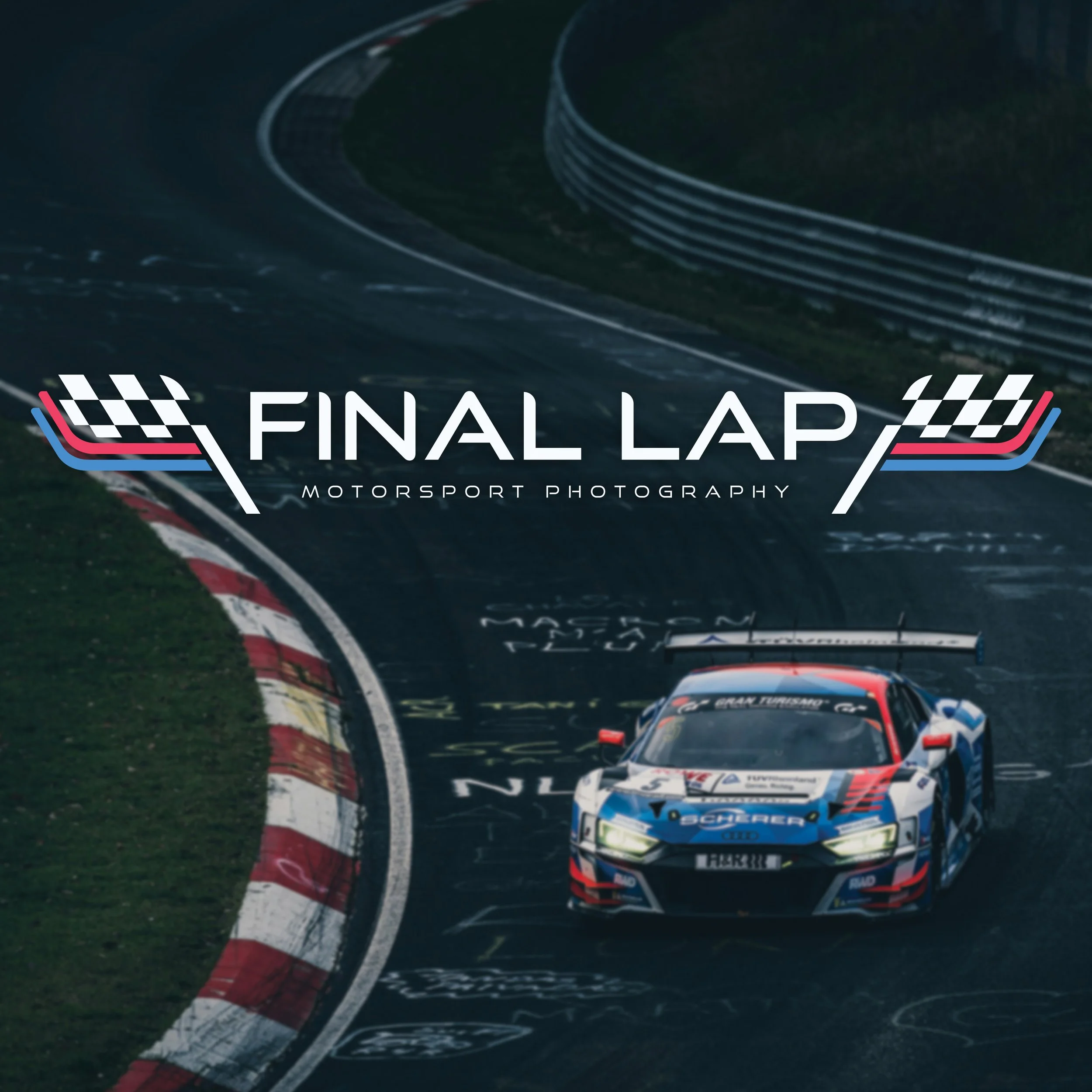
Final Lap Motorsport Photography, a fictional small scale photography studio that specializes in capturing the crucial moments in motorsport racing. I wanted to craft a brandmark that could embody speed, and the clean edges in many other motorsport designs
Challenges
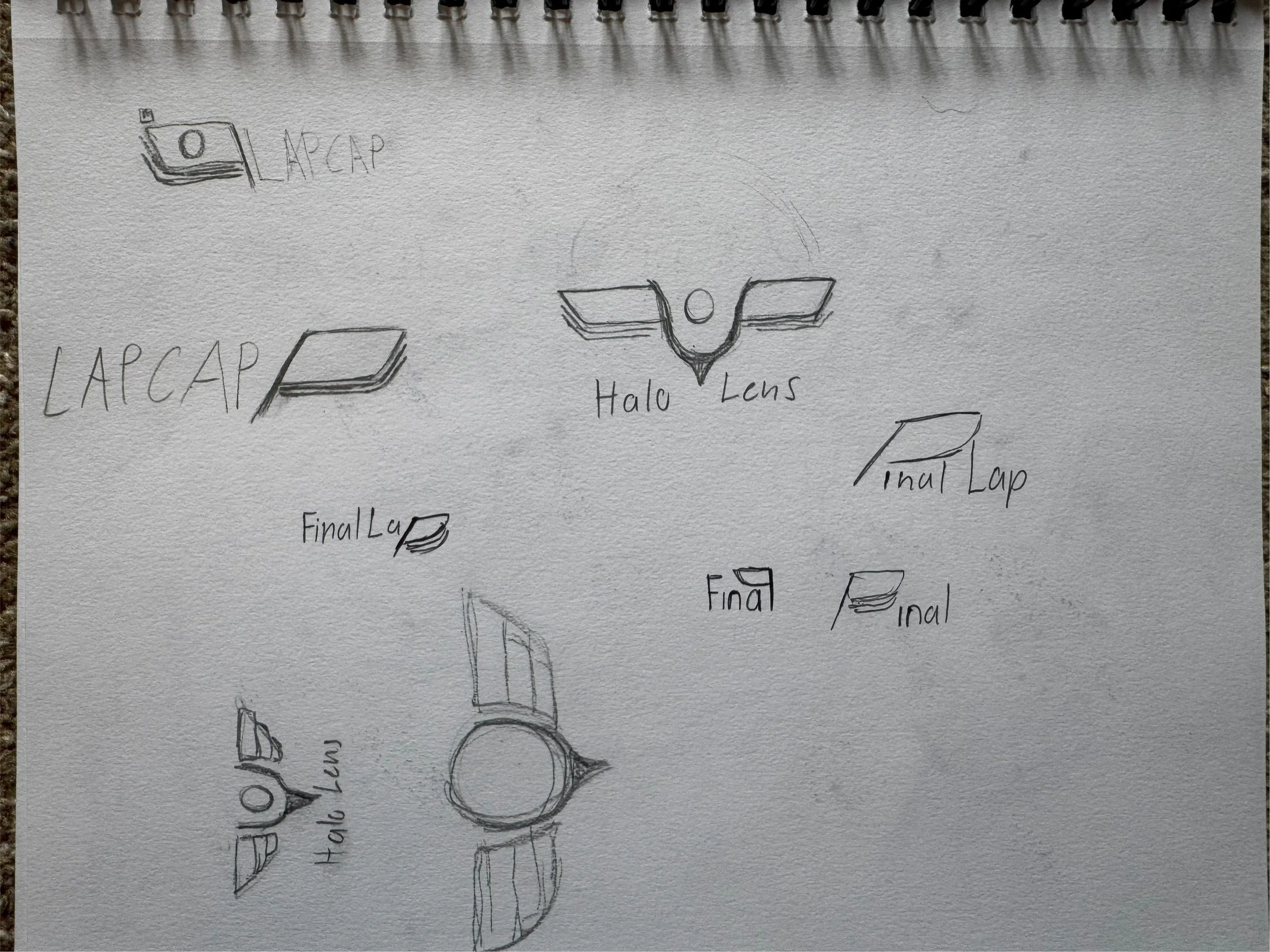
When designing for something broad such as a photography studio it can be easy to fall into common trends that can make it hard for your design to stand out. I know for this design I wanted to stray completely away from using any camera like visuals in the brandmark and logo as a whole. I wanted to make something that can more resemble racing first and photography second seeing as though the brand does focus on photography but in the specific niche of motorsports.
Research
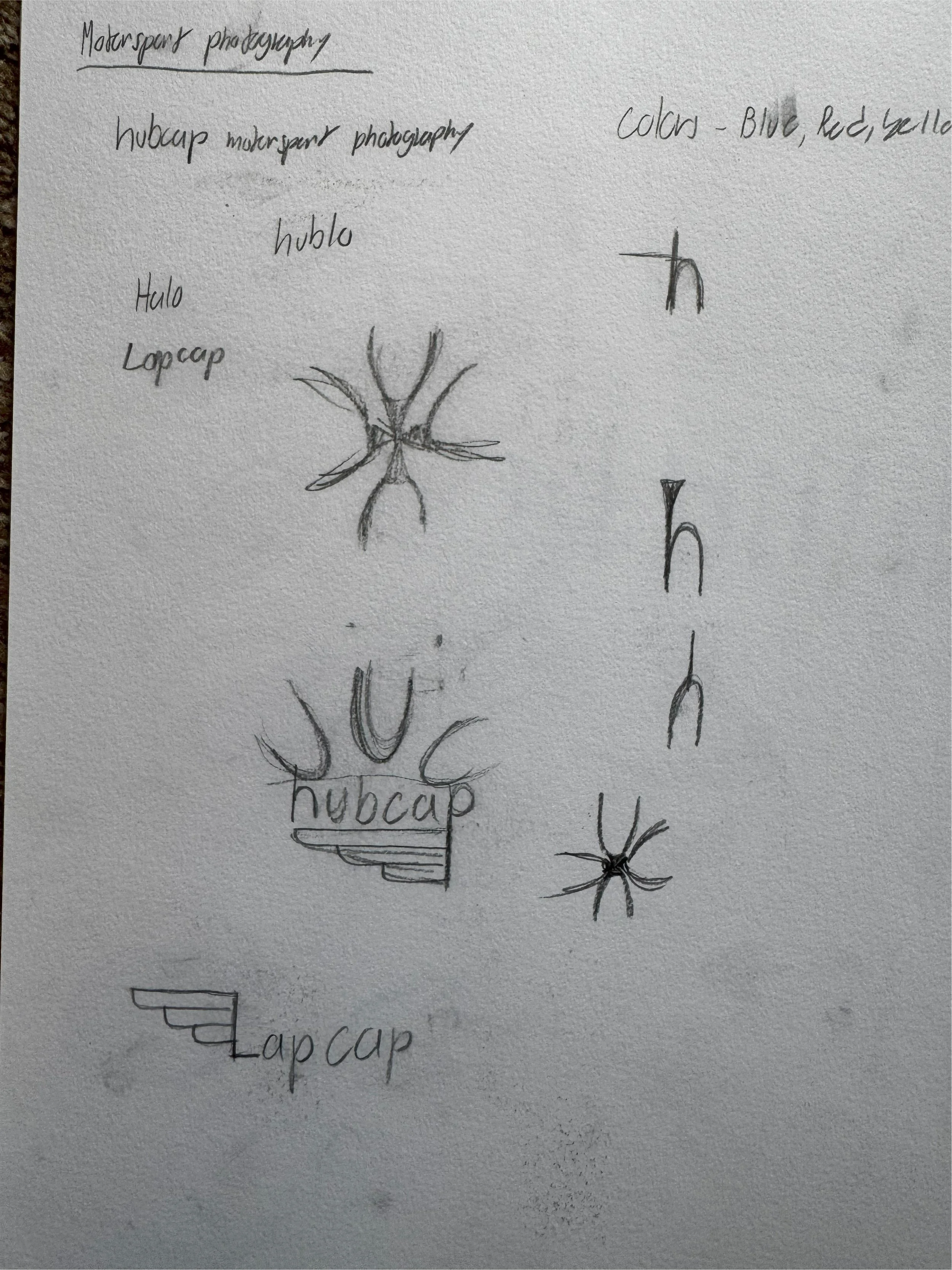
The starting point of the research for final lap was to dive into the origins of car racing. I found that racing originated in France which is what inspired the colors for the logo
I know I wanted to go for a name that was somewhat witty at first related to both cars and photography. Things like “Hubcap”, “Final Lens”, “Lap Cap". Eventually I went with “Final Lap” to show that this studio captured the most nail biting moments of a motor sport event
When looking at other motorsport logos and designs, I realized that a common them was a relation to wings and aerodynamics. This is what made me want to work symmetrical for the design.

The Design
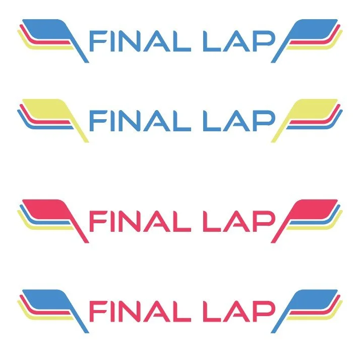
The concept logo I produced was supposed to be a three color system to resemble how a race starts in a “3…2…1” fashion. The brandmark is meant to resemble a flag or layers of flags to show that there are multiple laps in a race up until the top most flag, the checkered flag(Visible in the final logo). I placed two brandmarks on either side of the logo type to show the importance of aerodynamics in racing.
Colors
My final version for the logos connected back to racings French roots while still keeping close ties to the 3 color system with the red, blue and white.

01 Brandmark

02 Primary


Closing Thoughts
The joy of creating final lap came from really pushing for a clean symmetrical design. implementing the three color system made it a little easier to focus entirely on making a minimal logo hold as much meaning for the genre as it could.