
Busy Bees
Overview
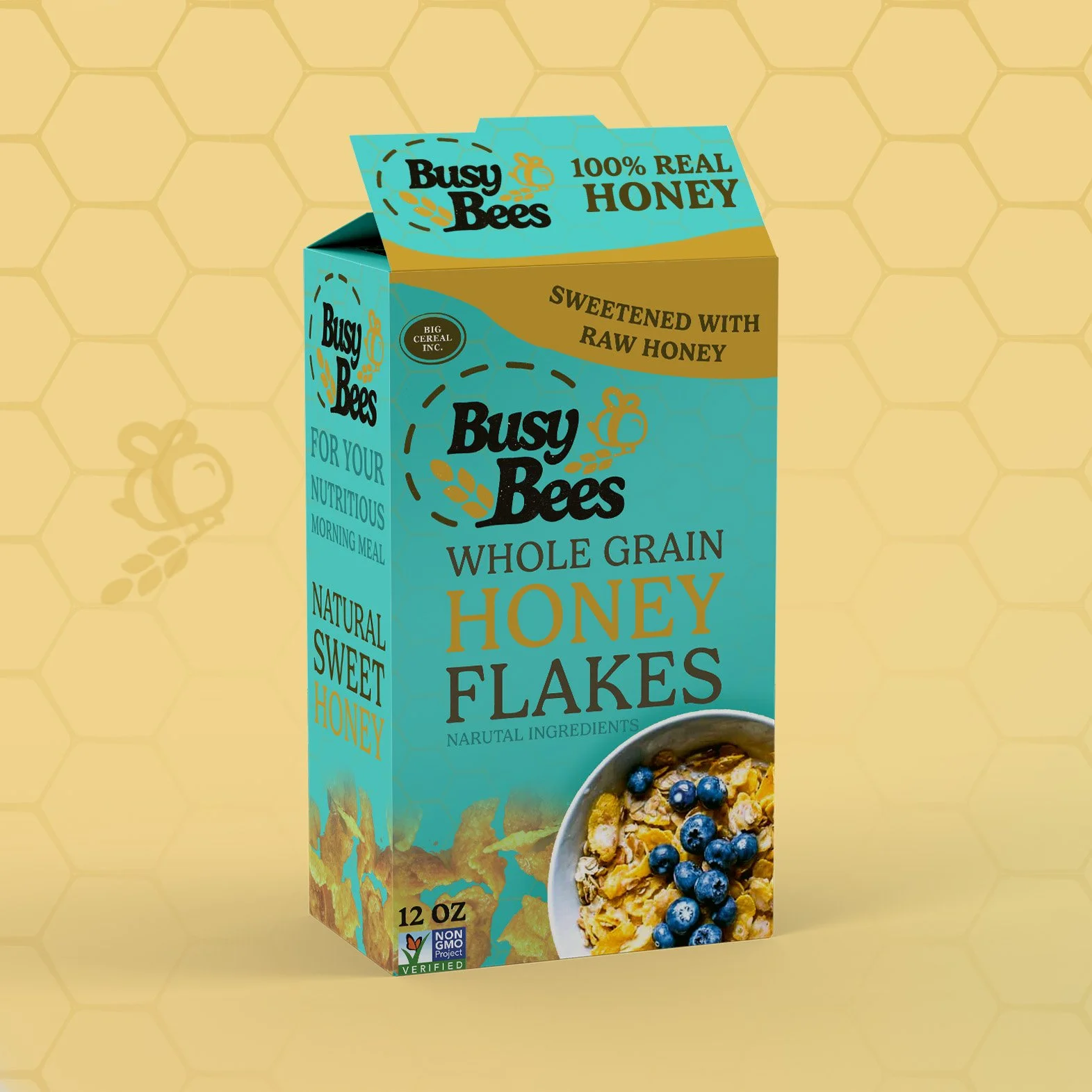
The most important meal of the day is a balanced breakfast. Busy Bees cereal is targeted at adults looking for a sweet but healthy start to their busy day. It’s important that this design was clearly marketed at adults but with a fun undertone.
Challenges
Most adult cereals aren’t supposed to be fun. They’re very facts first design second. I wanted to find a neutral middle ground of semi-fun design with a nod to the display of health on adult cereal boxes.
Research

The sketching phase for this one was very limited because early on I decided that I wanted to do something type focused. I knew for the brandmark I wanted to do something minimal but endearing.
The Design
I handpicked “Gelica” a font that would be a bold, rounded and serif. The vibes of a warm farmers branded product. In early concepts I had difficulties with making the brandmark too literal by having the bee with a suitcase showing that it’s busy just like the adults its marketed at. I scraped that idea and gave the bee a wheat grain to show that it’s doing its part of making you a balances breakfast. Giving the logo a more natural feel

Colors
For this project, I went with an on the nose, warm yellow toned pallet to give off natural honey vibes. The teal-blue color was thrown in as a contrasting element amongst the yellow and warm brown text.

01 Brandmark

02 Primary

Closing Thoughts
While it was challenging to create a cereal brand marketed at adults. I can say that busy bees does a great job at not being too fun to where the design is marketed towards a younger audience. The fun is mild enough to where the box design can elevate the maturity of the brand.